In the increasingly competitive consumer market with more and more products, the uniform square or rectangular packaging has long made consumers tired of it. In contrast, the unique cylindrical packaging has become a "traffic code" that stands out for many products due to its unique shape and customizability.
Tube packaging design itself is a strong visual attraction. Unlike the traditional square shape of packaging, its curves are softer and more designed, making it naturally more eye-catching when placed on shelves. Taking tea as an example, ordinary square tea boxes stacked together are easily submerged. But the cylindrical tea packaging, with its rounded appearance and techniques such as hot stamping and embossing, can immediately capture consumers' attention. After a well-known tea brand launched tube packaging design, the online click through rate increased by 40%, this is the bonus effect brought by the difference in design.
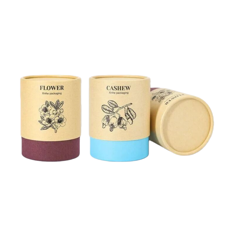
It is a structure of a top and bottome, common but not unsightly. When opened, it has a smooth feeling of "gently lifting" without any jamming, making people feel that the workmanship is relatively fine.
The lid is made of kraft paper, designed to be very simple, with only black line graphics printed; The bottom section was replaced with white kraft paper, which looks clean and neat. The contrast between the two materials is obvious when placed together, but the actual effect is quite coordinated. It looks a bit like a minimalist tea set, comfortable to look at without stealing the limelight.
The entire paper tube is made of food grade white cards, which have a decent texture to the touch. You don't have to worry about putting tea directly into it. This simple design actually appears more durable and does not create the visual fatigue of "excessive decoration".
The biggest highlight of this packaging is that although it is simple, it gives people a sense of "design"; The materials provide peace of mind; The way of opening the lid also has a sense of ceremony. Overall, you will feel that this thing is quite pleasing to the eye and quite practical.

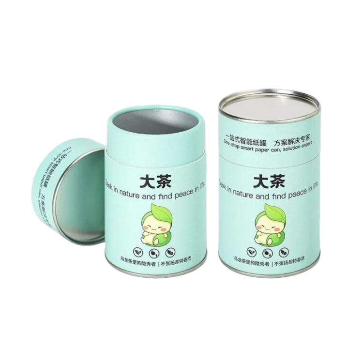
The overall idea of this tube packaging design still leans towards the route of "stability and sealing". The upper half of the inner wall is made of food grade white card, which is conventional and safe; In the bottom half, we replaced it with aluminum foil mainly to block moisture. When conducting tests before, after being placed in a high humidity environment for a few hours, compared to ordinary custom paper tubes, the humidity change inside was significantly smaller, which is indeed more friendly to tea leaves that are afraid of moisture.
The structure is a three piece set, consisting of an outer cover, inner tube, and bottom box. The overall structure is relatively sturdy and not easily bulged or deformed. The sealing is done with a double tinplate cover, which seals both the top and bottom tightly, and the tea aroma can be locked in. The color of the iron cover can be adjusted, making it convenient to customize the brand.
The appearance looks quite clean. The art paper is printed with four colors, and the color is more accurate than expected. It is covered with a matte film, which is not smooth to the touch but has a slight texture, and it will not have scratch at first touch.
Overall, I think this structure is particularly suitable for teas that require preservation, such as green tea and black tea. Its advantages are actually not complicated: it can indeed prevent moisture, has strong sealing, and the smell is not easily dispersed after being stored for a long time; Combined with the iron lid and aluminum foil, it's a bit like creating a "small sealed warehouse" for tea. A brand should be high-end and can also be supported by its appearance and texture.
More importantly, the tube packaging design structure is particularly easy to change. High end wine box can choose the alminum cap, and with a small metal tag, the whole set looks quite substantial.

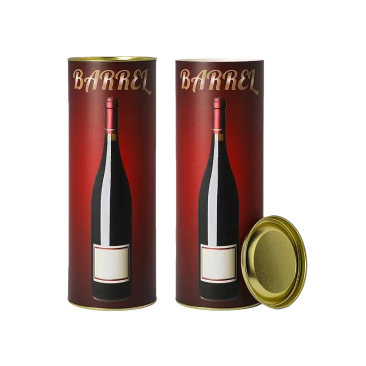
This tube packaging design is positioned as high-end overall, mainly due to its exquisite visual design. The structure is actually not complicated, just a common single tube, but the thickness and hardness are sufficient, and it will not soften when pressed by hand. The top cover is made of black aluminum, which opens and closes smoothly. The fine and cool feeling of the metal on site is quite impressive. The bottom is still sealed with tinplate, sturdy and there is no need to worry about transportation bumps. There is a lining inside that can hold the bottle in place and prevent it from swaying.
They used art paper for four-color printing on that tube packaging design, and the color gradient between dark and light is relatively stable. The visual sense of layering is slightly stronger than ordinary printing. The outer layer is also layered with UV and hot stamping, which together make it appear brighter. The details have a "flash but not exaggerated" effect, and the overall sense of luxury is considered achieved.
Firstly, there is indeed a visual impact that is easier to notice than conventional paper tubes;
Secondly, it can be made according to the height and size of the wine bottle, which is less likely to cause the bottle to become loose when placed inside;
Thirdly, the overall tone is on the high end, suitable for making holiday luxury gift boxes, commemorative items, or flagship products of brands.
Overall, this is a tube packaging design can that looks expensive and can withstand the details, making it suitable for recommending high-end series to customers.

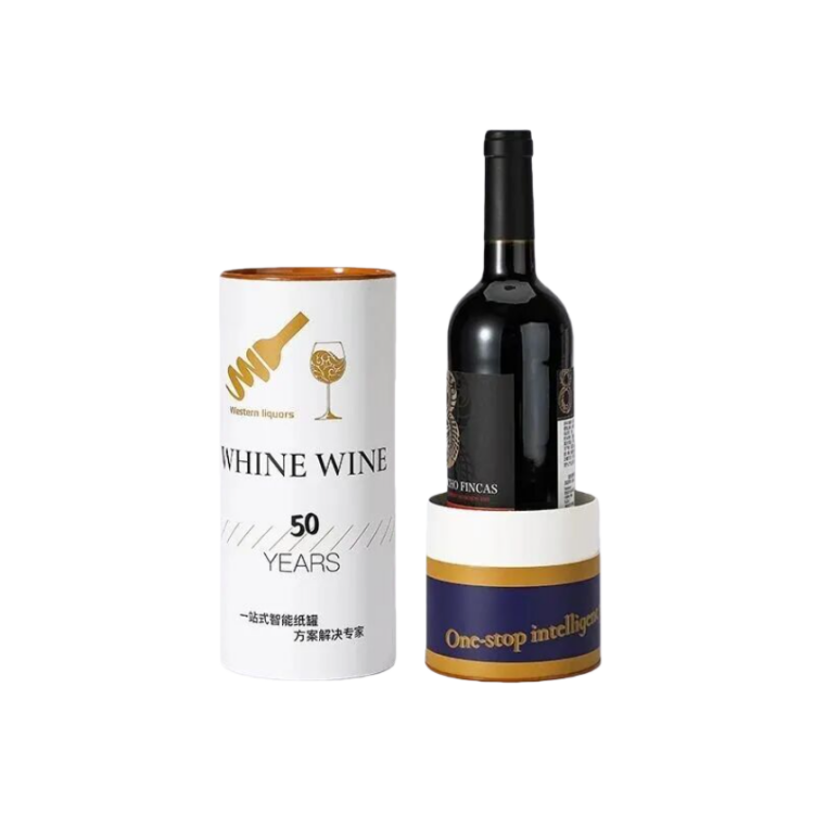
The structure of this tube packaging design t is not a conventional whole tube, but a type where the upper and lower sections can be separated, and the middle can be directly pulled apart. The first time you see it, you will feel a bit clever: it can quickly take out the wine, and the two separate tubes can also be used as small storage separately. It is also easier to display than ordinary custom paper tubes.
The sealing is still made of tinplate, with both ends sealed. The overall strength is sufficient, and it will not feel weak when held in hand. The color of the iron cover can be adjusted, which is quite friendly for brands that create a complete visual experience. The surface paper on the outside is coated with art paper and matte film, which feels relatively smooth. The low-key texture of matte film will appear more stable than glossy film.
The material inside is food grade white card, which is not a big deal because safety is the most important when in touch with the wine bottle. Overall, the protective performance is quite reliable, and both transportation and display are relatively reassuring.
Its highlight is still the "split style" gameplay, which makes the unboxing action more distinct and ceremonial for consumers. After separation, it can be reused, which is now highly valued by many brands. The overall protection is also online, and the all metal sealing has good pressure resistance.
If the customer wants to find a wine tube packaging design that is both creative and not too exaggerated, while also wanting to create some interactive experiences, this one can be considered.

In terms of practicality, it's actually not bad either. Tube packaging designs are not easily crushed during transportation and are friendly to fragile products such as bottles and cans. The internal space can also be designed according to the shape of the product, without wasting too much material. When consumers receive it, they often find the moment when they open the tube packaging quite interesting. Many people are even willing to send a photo or video to record it, which is equivalent to promoting the brand for free. If you have any other questions about tube packaging design that you would like to discuss, please contact us.
We chat
