Over the past few years, candle packaging idea has clearly changed. It’s no longer just about making something look nice on the shelf. More buyers now pay attention to the materials used, whether the packaging feels sustainable, and if it’s something they’d actually want to keep or post online. Because of this shift, simpler designs, natural textures, paper tubes, and eco-friendly packaging options are showing up more and more. For many brands, packaging has become part of how they communicate mood, values, and everyday lifestyle, not just a way to hold the product.
Paper tube candle packaging idea is exactly what it sounds like—a cylindrical paper container used as outer packaging for candles. It’s commonly seen in scented candles, home-use candles, and gift candles. Compared with traditional square boxes, paper tubes tend to feel sturdier and more distinctive in hand. Kraft paper tubes are especially popular because of their natural look and slightly raw texture, which fits well with brands that care about sustainability and a relaxed, organic image.
From a practical angle, paper tube candle packaging idea does its job well. The structure helps keep candles secure during shipping and storage, and it holds its shape better than thinner boxes. Opening a paper tube is also a bit different from lifting a standard lid, which adds a small but noticeable sense of ritual when the product is first used.
When it comes to design, paper tubes give brands plenty of room to experiment. Some keep it very minimal with simple text, while others add illustrations, embossing, or subtle foil details. Since the material itself is recyclable and biodegradable, this type of packaging naturally balances function, design, and environmental responsibility—one of the main reasons it continues to grow in popularity.
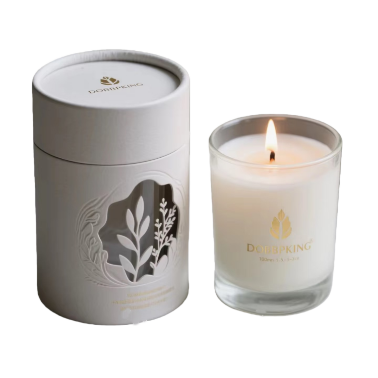
It is a typical upper and lower cover paper tube structure, which may not be particularly novel, but it is very easy to use. When opened, just gently lift and the lid will naturally separate without any looseness or jamming. At first glance, you can feel that this paper tube has been carefully designed in terms of structure and size.
The overall body of the cylinder is mainly made of light colored paper, with a relatively restrained surface treatment, without too many complex patterns, only embossed and partially hollowed out on the front. When you look closely, you will find that these details are not eye-catching, but they are very durable in light and have a quiet and delicate feeling. The lid and barrel have slight layering changes in the same color scheme, appearing clean and uniform without appearing monotonous.
The entire candle box is made of hard cardboard structure, with good stiffness. When placing glass candle cups inside, the support is also relatively reassuring, and there is no need to worry too much about collisions during daily transportation and storage. The paper itself has a delicate touch, giving the impression of being gentle, reliable, and not exaggerated.

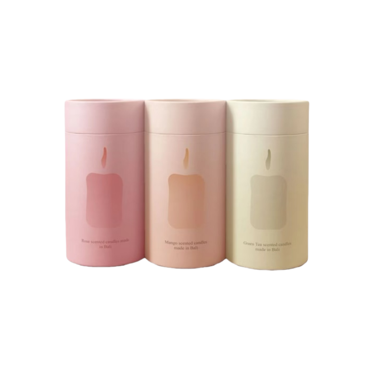
This set of candle boxes follows a gentle and clean route, without complex structures, with a focus on texture and consistency. It adopts a paper tube structure with upper and lower covers, and the opening method is very intuitive, making it easy to use.
In terms of material, this paper tube is mainly made of hard cardboard and can be stably supported even after being fitted with glass candles. The inner wall is treated relatively smoothly, and the fit to the candle cup is just right, without shaking back and forth. It is relatively reassuring for daily transportation or display.
The appearance is one of the highlights of this packaging. The three low saturation tones of pink, beige, and light green combined look very consistent, without any obvious problem of "which fragrance is more eye-catching". The surface only has simplified graphics and text, and the printing is not heavy, making the overall look cleaner, a bit like the quietness that aromatherapy should have.
In practical use, this paper candle packaging idea is more suitable for products that follow a lifestyle or gift route. It does not rely on complex craftsmanship to win, but instead creates comfort through color, proportion, and feel. The advantages are also very clear: the structure is simple but reliable, the appearance looks comfortable, and it is not abrupt when placed at home or as a gift. The overall impression is - not flashy, but durable and long-lasting.

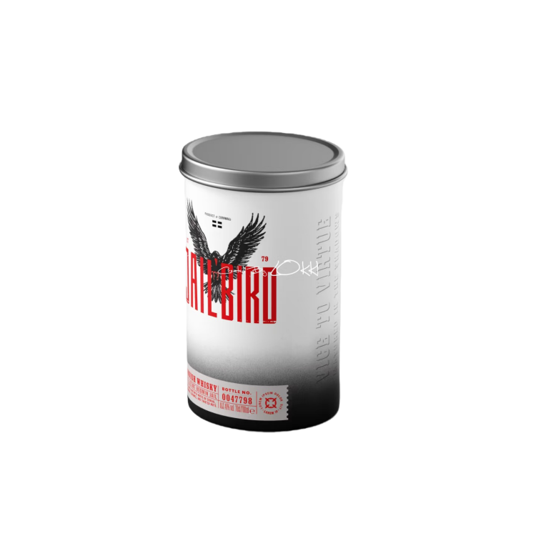
This candle box has an overall "tough, high contrast" style, which gives it a strong sense of power at first glance. Structurally, it is not complicated, just a standard single tube paper tube, but the material used is noticeably thick, and the tube body has sufficient hardness. It will not collapse when pressed down by hand, making it more reassuring to pack glass candles. The top is equipped with a metal cover, which opens and closes smoothly. When held in the hand, you can clearly feel the cool metallic touch, which matches the overall dark visual effect.
The bottom has also been reinforced, with good stability and is not easily deformed during placement and transportation. The internal structure is relatively clean, without any unnecessary complex components, and leans more towards the core function of "stably wrapping the candle", suitable for candle styles with relatively regular bottle shapes.
Printing and visual design are the focus of this packaging. The barrel adopts a large area of black and white gradient, combined with high contrast red text and graphics, creating a sense of layering and a clear visual impact. There is also a three-dimensional embossed treatment in some areas, and you can feel the subtle undulations when you touch it. It is not the cheap feeling of a pure flat surface, but rather adds a touch of industrial and collectible attributes to the overall design.
The advantages of this paper candle box are actually very clear:
Firstly, it has strong visual memory points and is not easily overlooked when placed on shelves;
Secondly, the structure is solid and the materials used are thick, providing adequate protection for glass candles;
Thirdly, the overall tone is high-end and personalized, making it more suitable for limited edition, co branded, or brand image series.

The overall structure is a standard straight tube, but the proportions are made relatively slender, giving it a clean and neat appearance without any unnecessary decorations. The natural color of kraft paper paired with light colored labels is visually appealing but durable, suitable for brands that cater to lifestyle or fragrance preferences.
The tank body is made of thickened cardboard structure, and the upper and lower covers are designed with embedded materials of the same material. The opening and closing are smooth, and the gap is controlled to be relatively small after the cover is closed. The overall feeling is strong, and when placed together, it will not appear cheap. When multiple items are displayed side by side, the height and diameter are uniform, which looks neat and suitable for series display.
The outer surface paper is made of original color kraft paper, which is not treated with film coating and retains the fiber feel of the paper itself, making it feel dry to the touch. The labels are individually labeled, with relatively light colors and low-key font and graphics. The overall emphasis is on "smell" and "content" rather than the packaging itself, which is quite in line with the temperament of slow consumption products such as aromatherapy and candles.
The internal space is relatively friendly to the wrapping of candle jars or aromatherapy bottles, and there are no problems with regular transportation and daily display. The focus is not on heavy protection, but on the balance between "just right" protection and display.
The advantage of this candle packaging idea lies not in its structural innovation, but in its overall completeness: uniform materials, comfortable proportions, and strong sense of series. Suitable for customers who do not want the packaging to be too complicated, but still want the brand to look stylish and have sustainable extension space. If it is a product that focuses on the aesthetic direction of life, such as aromatherapy, candles, and essential oils, this paper tube solution will be more secure and not easily outdated.

Creative candle packaging idea offers more than just protection for candles—it helps shape a brand’s identity. With its natural texture, minimalist look, and eco-friendly appeal, candle packaging idea creates a warm, premium first impression. It enhances shelf presence while keeping the design clean and timeless. Thoughtful structure and subtle details can also add a sense of ritual to the unboxing experience. For candle brands seeking differentiation without being overdesigned, candle packaging idea is a smart, balanced choice that supports both aesthetics and sustainability.
We chat
